With the launch of one phone in the F1 series back in January, the Oppo company has come up with another phone Oppo F1 plus. The phone is similar to F9 model released by the company few months back and is already creating hype in the smartphone market.
Like its predecessor Oppo F1, this phone has also been tagged as the ‘selfie expert’ due to the high-resolution camera attached to this device. However, don’t just think this phone as an up gradation of Oppo F1 as this phone tends to offer much more features that were missing in the debut phone of the F1 series. For example, the phone has come up with a look with much more curves and the rough edges have been remodeled. The thickness of the phone has been reduced, and the screen size has increased significantly.
Don’t miss: OPPO release its SELFIE EXPERT phone in India
Oppo F1 Plus Selfie Expert Review – This Smartphone tends to offer much more features
Let’s dive in a little deeper and see what more this phone has to offer.
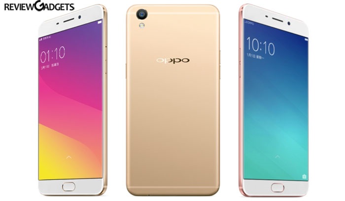
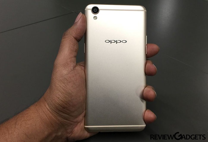
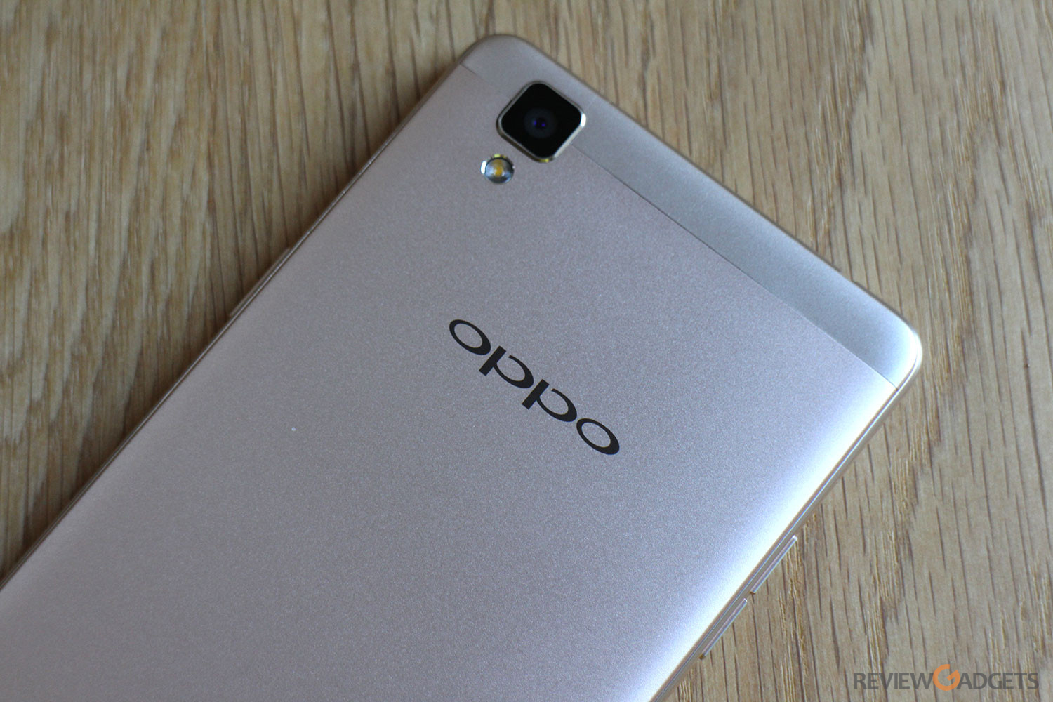
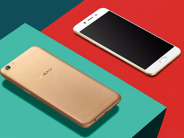
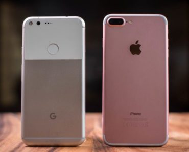
Design and Look: Unlike its predecessor, this phone does tends to get its look inspired by the new IPhone 6. But, the company has made sure that this phone does not entirely look like the Apple product. The company has made numerous changes in its design, and this phone gives a feeling of holding something premium in hand. The new phone is supported by a fully metal body and is only 145g in weight. The screen size has increased to 5.5 inches while the Gorilla Glass Class 4 is still utilized for screen protection.
Apart from this, the phone has capacitive buttons which are backlit, and the home button has the fingerprint sensor, whose speed impressed us a little. The power and volume buttons are located on the either side of the phone and are easy to reach and use. The SIM tray is on the right and either you can install two SIM or a single SIM and a memory card. The phone is much more premium in look than F1 and is also thinner with its thickness reduced to 6.6mm. Overall the design and attention to details in this phone impressed us a little.
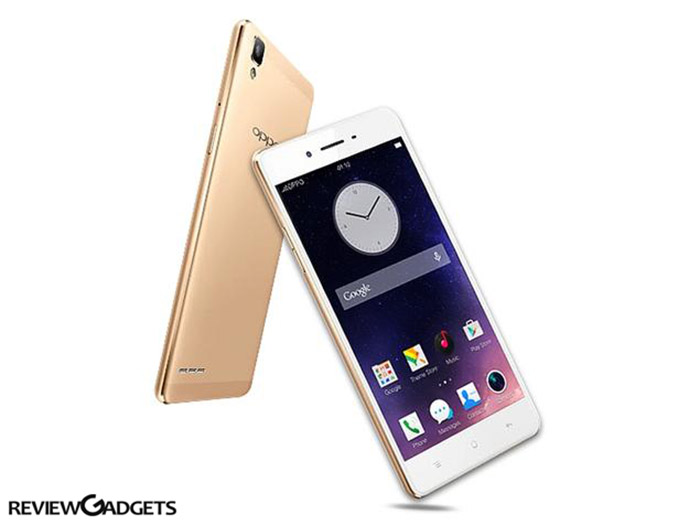
Software: The Oppo UI ColorOS has acquired a new version i.e. V 3.0. The new software again tends to be inspired by the Apple’s IOS, and you can easily see some of the icons, being pulled out straight out of it. There are new icons included; while there have been significant changes in the notification panel of the phone and it is now available in two tabs, one for notification and one for setting changes.
Pressing the recent buttons displays all your applications as cards and you can either choose to slide through the applications or flick it above to close them. You can change the home screen and add new widgets, but the device still runs on Android 5.1, the update of which is soon expected.
Pre-installed applications that come with the device include a file manager, King soft Office, Google applications, and security center. There are ample choices of themes available which you can choose and apply according to your needs.
Touch and Display: We are already talking a lot with regards to the display of F1 plus as this one area where the phone tends to overpower the basic version completely. Apart from the screen getting bigger, the device has also switched from conventional LCD to AMOLED, the one used by Samsung. The maximum brightness offered by the device is 351 units, which is low as compared to Samsung, but still very much better than LCD. The color and contrast levels of this phone have increased significantly and so has the visibility in bright daylight.
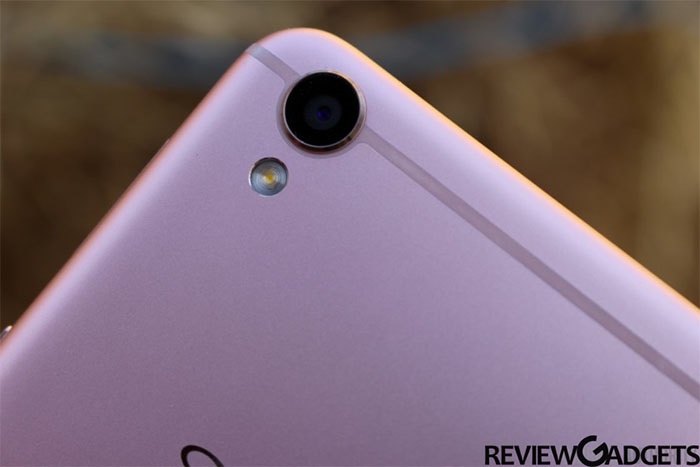
Camera: The new F1 plus is very much proud of its camera, and why shouldn’t it be. The phone has been fitted with 16MP of single focus front camera (YES!! You heard it right) with suitable aperture. The photos clicked in bright daylight are excellent and sharp. However, in artificial lighting the image quality starts to drop and in the night noise is visible. What this phone lacks in is a dedicated flash, and the screen flash is too dim for clicking images in low light.
If we talk about the back camera of 13MP and f/2.2 aperture, it tends to capture some very decent detailed images. Even in low light, the images produced are excellent, however, when you zoom in, the image noise is clearly visible. Video recording is also good and the max resolution supported is 1080p.
Battery Life: This phone has been packed in with a battery of 2850mAh capacity which lasts for around a day when used on 4G network. Also, this phone comes with a VOOC fast charging system which tends to recharge the phone to 56 percent in half and hour of time. However, you need to carry the special USB charger and USB cable provided with the phone as normal USB cables won’t work.
Phone Accessories: Upon unboxing the device, you can find the usual warranty card and user manual. Apart from this, you will get a transparent back cover and a special wall charger with USB cable. And hola!! Music lovers, there is a decent piece of earphones for you.
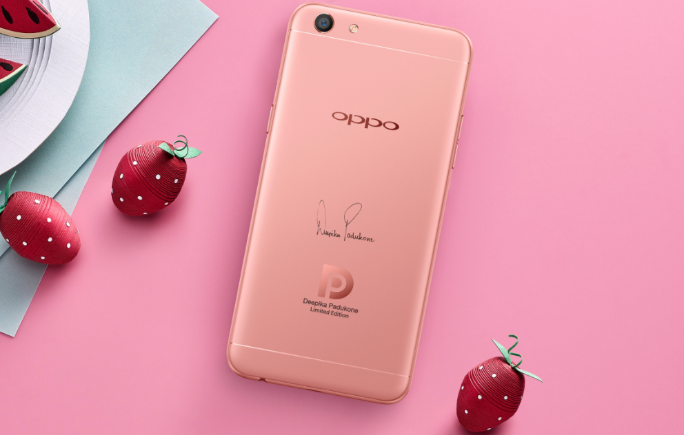
Variants: This phone is available in two colors rose gold and gold, and both of these are priced at 26999 INR. Both the colors of this phone are nice but rose gold is something new and fresh.
Verdict: The phone in terms of its looks is similar to IPhone but that according to us is not a bad thing. People who want the premium design and finish like Apple products can go for this as this phone is available at a relatively cheaper rate than IPhone 6. The phone has been designed exceptionally well, and special attentions have been given to details. Some of the best features of this phone include a fast fingerprint sensor, decent battery life, etc.
Some of the areas which require improvement are viewing angles and a bit of bluish tint on the screen. Also, the front camera despite being of 16MP takes poor images in low light. With such limitations, the phone according to us could has not been correctly priced. There are phones such as MI5 and Oneplus two which are giving tough competition to this device in terms of features and performance.

